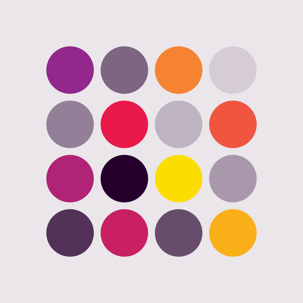
Primary colour palette
Our primary brand colours are a vibrant expression of who we are – radiating energy, vitality, and the warmth of genuine human connection.
They reflect our optimistic outlook and the meaningful relationships we foster, both within our team and with those we serve. Aligned with our core messaging, these colours reinforce our commitment to nurturing a strong Firm culture and prioritising workplace wellbeing.
Primary colour usage
Brand expression: Use the primary palette to convey energy, personality, and creativity.
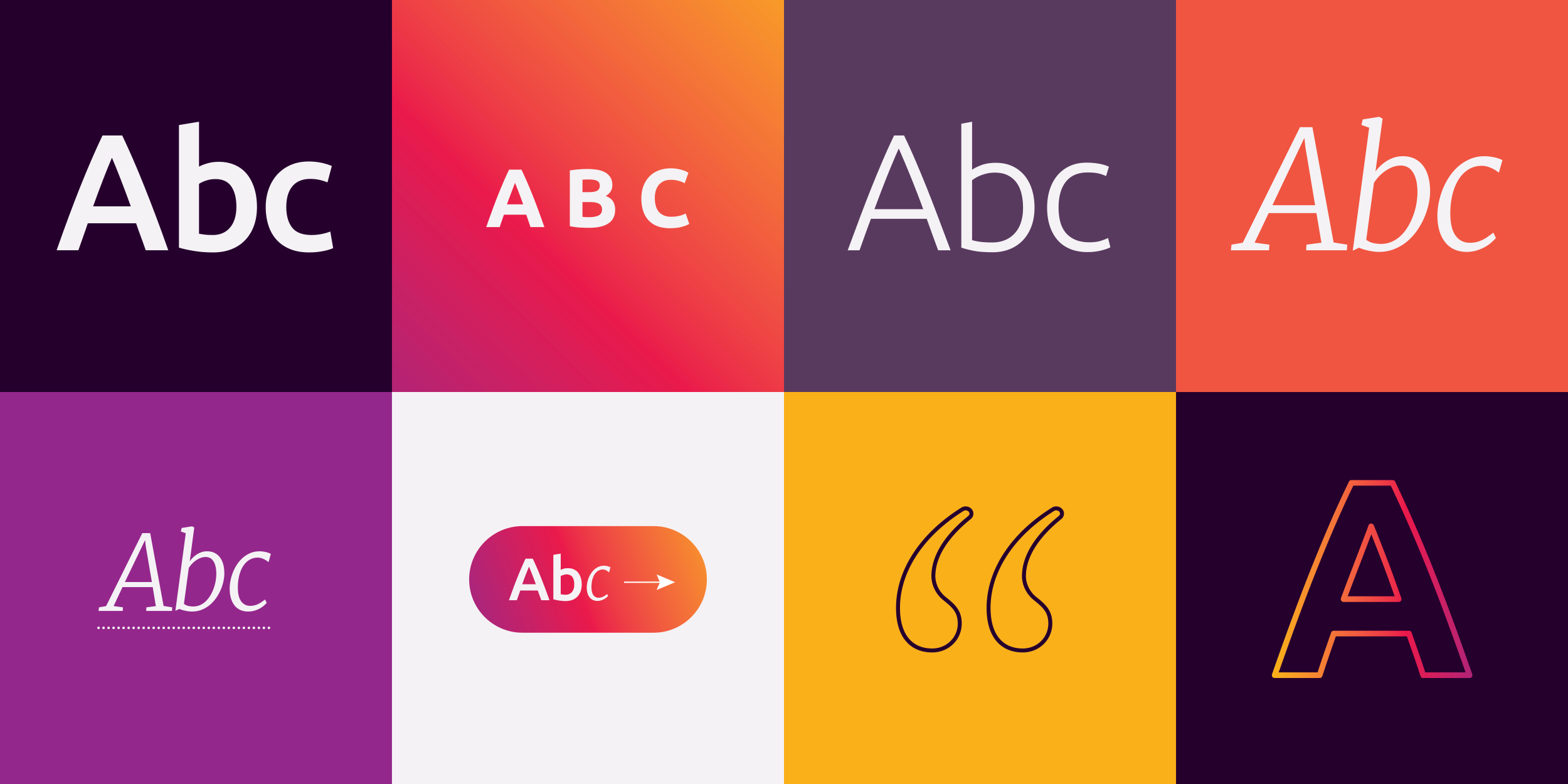
Calls to action: Buttons, icons, or key messaging should use vibrant shades to draw attention.
Highlights and accents: Use selectively to emphasise content or design features.
Primary colour gradients
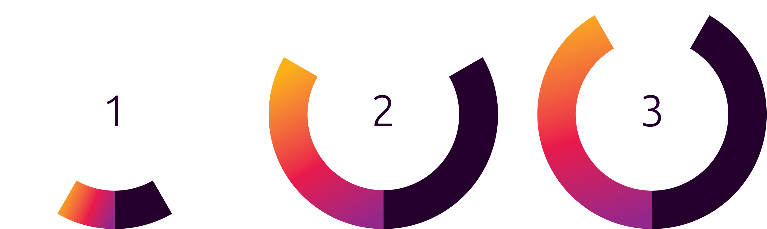
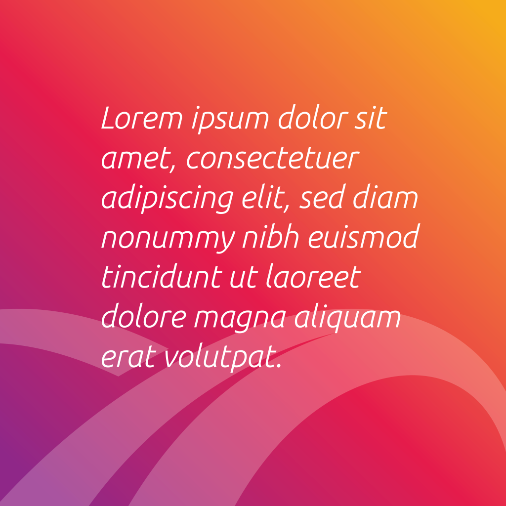
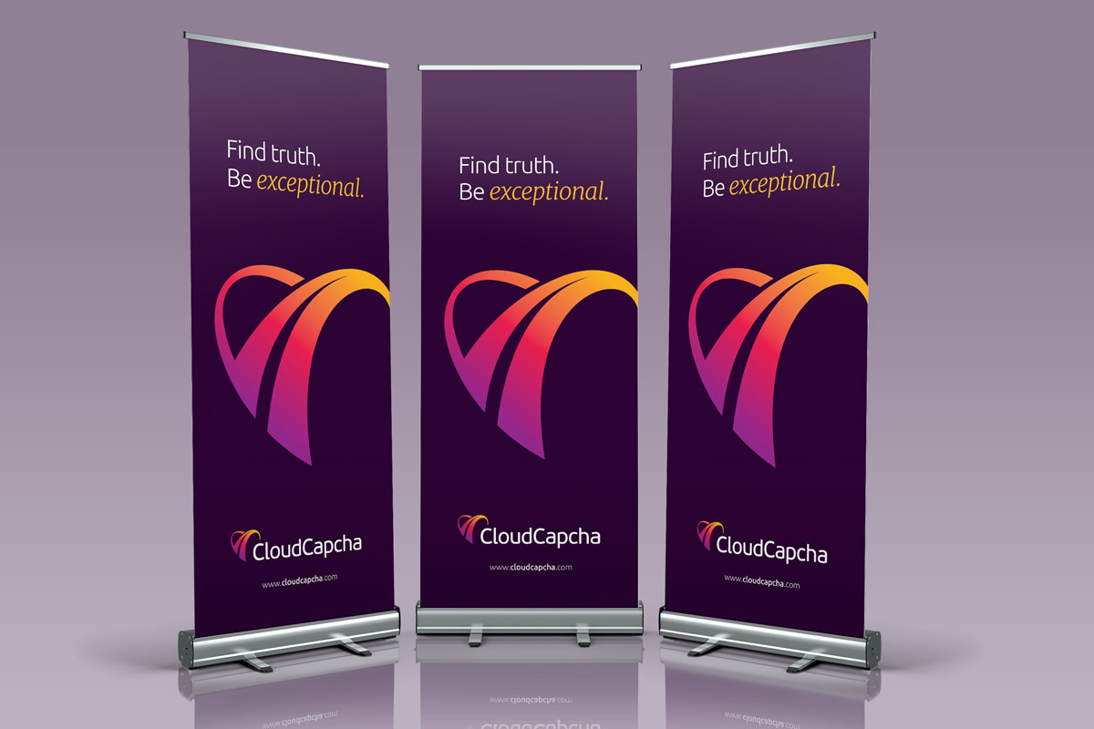
The primary colour gradient is a dynamic blend that embodies the brand’s expressive range and can be used for buttons, icons, hero sections and occasionally as a background.
To recreate the primary colour gradient, set the first point to Violet, the mid point to Red and the end point to Yellow.
Additional to the primary colour gradient, subtle gradients can be created by using the following combinations:
Gradients can be used horizontally, vertically, or at an angle.
Do not use Lemon in any gradient.